Mar 27, 2024
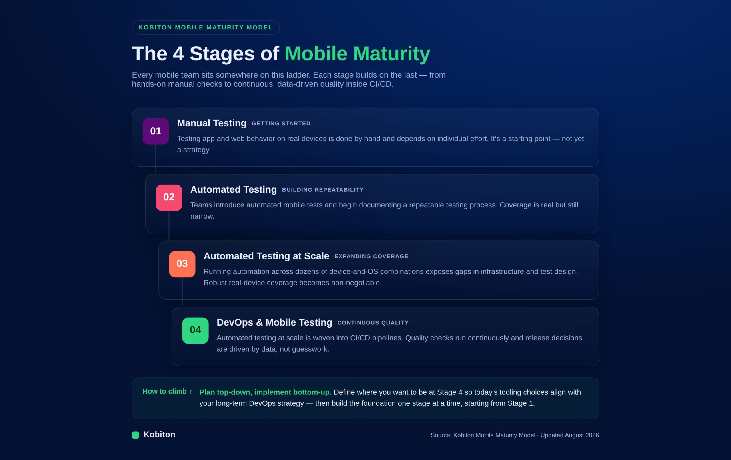
How The Kobiton Mobile Maturity Model Can Elevate Your Mobile Strategy

Frank Moyer
Read More

There is a good chance that you’ve encountered mobile apps that fall short of your expectations, no matter what their intended purpose is for. Many times, it simply boils down to poor wireframe design for mobile apps.
So, it is important to study what effective mobile app design and development can look like — both from a developer’s perspective, and from that of its end users. Mobile app design is a continually evolving project, requiring ongoing improvements based on user feedback and market trends.
Here, we will consider how to design a mobile app with core methodologies and practices to elevate that app design process. With that understanding, you will then be able to provide more thorough testing strategies to achieve greater development success with our mobile design.
As with every technical process, there are essential principles which underpin effective mobile app design. Those principles include:
Adherence to these principles will help you to create intuitive interfaces that facilitate seamless user interaction. Doing so allows you to ensure your app attracts and retains as many users as possible.
An intuitive, user-centric design is crucial in enhancing user satisfaction and retention. Conversely, a design that users find challenging to either understand or operate will result in significantly less use.
Think about how pivotal design can be in facilitating an efficient and enjoyable user experience. From visual appeal and layout to touchpoints and processes, as well as the importance of interactive design elements that are familiar, predictable, and easy to tap, design matters.
Let us now think about how certain techniques and strategies can help engineers analyze and understand the user needs that need to be prioritized during the mobile design process, and how to address them.
Gather and interpret user feedback. Technology today allows us to track user behaviors more than ever before, and it presents an opportunity to identify moments which users find counterintuitive, or when they might abandon the App Store product entirely. Additionally, many end users happily share feedback or reviews of their experiences, either for the benefit of other users or to help your design team know what to improve upon.
Match the method to the question. A few behavioral techniques are especially useful for design decisions:
Utilize analytics. A number of tools exist to collect data for analytics — do some research to figure out which are most appropriate for your own needs and make note of user behaviors. Are they using the mobile app in a way you intended? You might also learn of features that are going unused; analytics can help you learn about that, as well.
Apply this information to create a user-centered design. Gathering information about all that user behavior is great, but it’s all for naught if it doesn’t then inform revisions and updates.
Taken together, user data and research should be prioritized when making design choices and allocating resources throughout the development process. Doing so will only enhance the app’s relevance to its target audience.
Okay, so let’s say that you’ve successfully released a mobile app to the general public. Hooray! But then you notice something concerning: use of the app is not as frequent as you had hoped.
The answer, in one word, is engagement.
Engagement strategies should be key to any development cycle. They exist to help us consider ways to hook users with interactive content, timely updates and notifications, and even robust community-building features.
To maximize engagement, consider the peak hours of mobile usage and time your push notifications accordingly. For example, there may be periods of time when users are online and active on different apps, but not yours; perhaps that would be a good time to give them a reason to check in on yours.
However, user engagement strategies are not simply a one-and-done step of the development cycle. It’s important to continuously update and refresh applications with new content, features, and functionality to keep users interested and engaged.
Engagement starts in the first minute, not the first month. A new user has just installed your app on a hunch, and every screen between them and the thing they came for is a chance to leave.
The impact of customizing user experiences within an app to enhance engagement and satisfaction simply cannot be overstated. Considering mobile users’ expectations for fast loading time, ease of use, and satisfaction during use is crucial. It can save end users time, accelerate their comfort in using the application, and it increases the chances they will recommend it to friends and colleagues.
Integrating game-like design elements can increase user interactivity and make the app more engaging. Video game popularity is soaring, and users don’t necessarily need to have an exclusive game download to enjoy features that add a bit of fun.
It’s a busy world we live in today. If you struggle to stay on top of to-do lists and obligations, you are not alone!
So, it makes sense that users – no matter how engaged they are with your app – might benefit from mobile app design best practices, such as push notifications to remind them of updates, new features, or even tracking objectives that they need to stay on top of.
That said, notifications are a privilege users can revoke with one tap. Overdo them and you’ll get muted, or uninstalled. A few rules keep them welcome:
A mobile app designer plays a crucial role in creating the visual and interactive elements of a mobile application. This multidisciplinary role involves user interface (UI) and user experience (UX) design, ensuring a seamless and intuitive experience for users within the constraints and opportunities of mobile platforms.
Ultimately, we are all driven to create an engaging and user-friendly mobile app. And, with UI/UX in mind, there are best practices that professionals at Kobiton have come to understand and recommend for all clients.
There are other best practices, of course, and below we will dial in a bit closer to learn about them.
The same goes for typography, icons, spacing, and UI components. When a button looks and behaves the same everywhere in your app, users learn it once and stop thinking about it. A shared design system or component library is the most reliable way to keep that consistency as the app and the team grow.
This is the principle of designing an app with easy-to-understand, logical navigation paths for the best user experience, considering how users interact with the application, including gestures like swiping, pinching, or tapping. It sounds like common sense, but we all know how quickly mobile app development priorities can complicate the process.
Quick: how many hands are you using right now to hold your phone? Most of the time, people tap, scroll, and swipe with a single thumb while the other hand carries coffee, holds a handrail, or pushes a stroller. Your layout should assume that.
Research on how people actually hold their phones points to the same pattern: the center and lower-middle of the screen are the easiest areas to reach and read, and the top corners are the hardest, especially on today’s larger devices. Designers often call the comfortable area the thumb zone, or the “green zone.”
A finger is far less precise than a mouse pointer. When a button is too small, or packed too tightly against its neighbors, users miss, tap the wrong thing, and blame the app. Both Apple and Google publish minimum sizes, and they are worth treating as floors, not targets.
Size is only part of it. iOS and Android users carry different expectations about where things live and how they behave, so an app that ignores those conventions feels foreign even when it’s well built. Here is how the two platforms compare on the decisions that come up most often:
| Design decision | iOS (Human Interface Guidelines) | Android (Material Design) |
| Minimum touch target | 44 x 44 points | 48 x 48 dp |
| Unit of measure | Points (pt) | Density-independent pixels (dp) |
| Primary navigation | Tab bar at the bottom of the screen | Navigation bar at the bottom (typically 3 to 5 destinations), or a navigation drawer for larger sets |
| Going back | Back button in the top-left of the navigation bar, plus a swipe from the left edge | System back gesture or button, handled by the OS |
| System typeface | San Francisco (SF Pro) | Roboto |
| Text scaling | Dynamic Type | Font size and display size settings |
Leave space between targets as well as making them big enough. Two adequately sized buttons with no gap between them still produce mis-taps.
Gestures make apps feel fast and natural, but they have one big weakness: nobody can see them. A swipe-to-archive that users never discover might as well not exist.
Every interaction also needs feedback. When users tap and nothing visibly changes, they tap again, or assume the app froze. Small micro-interactions solve this: a button that depresses, a brief haptic tap on a toggle, a checkmark that animates on save, a progress indicator the moment a request starts. These details make an app feel responsive and trustworthy. Keep them short and consistent so they help rather than slow people down.
Mobile-first design is one of many mobile app design best practices, and it is vital that your applications visually and functionally adapt across different devices and screens. Delay in responsiveness can be irksome, at best; it can lead to user abandonment in a worst-case scenario.
Every application is designed with an expectation that users will take certain actions more frequently than others. Visual elements like buttons, icons, and graphics are crucial in creating intuitive experiences and optimizing interfaces for touch on limited mobile screens. That, friends, is where visual hierarchy comes into play. This strategy allows engineers to direct user focus toward critical elements through design, ensuring seamless user interaction with the app throughout.
A few techniques do most of the heavy lifting here. White space is the first: giving key elements breathing room draws the eye to them far more effectively than making everything bigger or brighter. Size, weight, color, and contrast then rank what’s left, so the primary action is unmistakable and secondary options recede.
Design for scanning, too. Mobile users glance more than they read, so lead with the most important information, keep text blocks short, and use clear labels and headings. Finally, design with real content wherever possible. Placeholder text hides the long product name that breaks a card layout, or the translated label that no longer fits its button.
Every icon, banner, and menu item competes for a few square inches of screen. Each one has its place, but everywhere and all at once is never the answer. A few techniques do most of the work:
Accessibility is easiest and cheapest when it’s part of the design from day one, rather than a retrofit. The Web Content Accessibility Guidelines (WCAG) apply to mobile apps as well as websites, and a handful of checks cover the most common problems:
Now let us discuss some of the crucial aspects of app performance and optimization. Investing in techniques to enhance speed, ensure reliability, and improve overall user satisfaction is time well spent.
It is also important to consider designing for Android apps, taking into account different device resolutions, responsive design for mobile apps, and the need to design for various device types and platforms within the Android ecosystem.
Here, I will share actionable insights on how developers like you can minimize load time, boost system efficiency, and significantly reduce an app’s impact on battery life.
Design for Poor Connections and Interruptions
It’s easy to design as if every user is on fast Wi-Fi with nothing else going on. Real mobile use looks different: elevators, subway tunnels, rural dead zones, and a phone call arriving halfway through checkout. Good mobile app design plans for those moments instead of treating them as edge cases.
Then test these paths deliberately. Throttle the network, switch to airplane mode mid-action, and try the app in physical locations where coverage is known to drop. These flows rarely get exercised in a well-connected office, which is exactly why they fail in the field.
Users don’t separate “the design” from “the app being slow.” To them, a beautiful screen that takes too long to appear is a bad design. Many of the choices that decide how fast an app feels are made in design, long before anyone profiles the code.
It’s important to design apps that can easily be scaled, in both functionality and user base, without degrading its performance or impacting UI/UX. To do so, smart engineers will consider server infrastructure, data handling, and the adaptability of the UI/UX design.
When writing clean, modular code that allows for easy updates and maintenance, there are important considerations to keep in mind: documentation, code reviews, and a solid mobile app testing framework. Each one can help you to ensure ongoing app quality and performance.
Precautions related to security should always be prioritized as a critical aspect of development and include data protection, secure communication protocol, and authentication methods to safeguard user information and enhance trust in the app.
Often, we include third-party services within an application’s functionality. It is vital to understand, then, the importance of selecting reliable services, managing API keys, and ensuring smooth user experience through these integrations.
I have already shared how important customer feedback and user data can be, especially when it comes to evaluating the best ways to update your software applications. There are a number of traditional (and newly trending) methods you can use to achieve significant feedback and testing processes.
How often do you check in with your users? They decided to explore your application, so at some point they had at least some small degree of interest. Personally, I am a strong advocate for regular testing with real users, to identify and rectify design issues that could hinder user experience. Despite our best testing efforts, there are so many issues that can still come up for those we design the apps for. To maintain and increase market share, it’s important that designers be aware of those potential issues.
A mobile design almost always looks fantastic on the designer’s monitor. The question is how it holds up on the phones your users actually carry. Screen sizes, pixel densities, notches and cutouts, manufacturer skins, and hardware speed all vary widely, especially across the Android ecosystem. Emulators are useful early on, but they won’t show you how a real mid-range phone renders an animation, how a cutout clips a header, or how a layout reflows when a user has bumped up the system font size.
You can’t test on every device, and you don’t need to. Cover the classes where designs tend to break:
| Device class | What tends to break |
| Small-screen phones | Truncated labels, crowded tap targets, primary actions pushed below the fold |
| Large and tall phones | Key controls drifting out of thumb reach, awkward empty space |
| Mid-range and older Android devices | Janky scrolling and animations, slow image loading, longer startup times |
| Devices with notches, cutouts, or rounded corners | Headers and buttons clipped or hidden behind system UI |
| Tablets and foldables | Stretched single-column layouts, broken state when the screen size changes |
| Any device with large text or accessibility settings on | Overlapping text, buttons that no longer fit their labels |
Run these checks before launch, not after. A layout problem caught in design review costs minutes to fix. The same problem found through one-star reviews costs users.
Here’s one more: iterative design. It’s vital to encourage continuous improvement based on user feedback. It can help to create an effective, efficient, and enjoyable app. And isn’t that at the heart of all we strive to do? Mobile app design best practices like this one can enhance and shape user experiences over time.
Mobile app design is the process of shaping how an app looks, feels, and works on phones and tablets. It covers user research, information architecture, navigation, visual design, interaction, and accessibility, all within the constraints of small touchscreens, one-handed use, and unreliable connections.
User experience (UX) design is about how the app works for the user: the flows, structure, and how easily people accomplish their goals. User interface (UI) design is about what they see and touch: layout, typography, color, icons, and controls. Good mobile app design needs both. A beautiful interface on top of a confusing flow still fails.
Apple’s Human Interface Guidelines recommend at least 44 x 44 points, and Google’s Material Design recommends at least 48 x 48 dp. Treat these as minimums, and leave space between targets so users don’t hit the wrong one.
Your brand should be consistent, but platform conventions should be respected. Navigation patterns, back behavior, system fonts, and common controls differ between iOS and Android, and users expect apps to follow the conventions of the platform they’re on.
Combine usability testing with real users and testing on a representative range of real devices, including small and large phones, mid-range Android hardware, tablets, and devices with accessibility settings turned on. Also test under poor network conditions and interruptions, since that’s where many mobile experiences break.
The usual suspects are tap targets that are too small, cluttered screens with no clear primary action, forcing registration before users see any value, overusing push notifications, ignoring platform conventions, and only testing on a single high-end device over fast Wi-Fi.
By prioritizing both the aesthetic and functional aspects of mobile app interface design, we can foster user satisfaction and business success. Both concepts should be equally prioritized, and it’s important that we make note of popular strategies to do so.
If you’re ready to experience firsthand the benefits of streamlining your own mobile app design process, then look no further: Get a Free Demo Today!