Dec 2, 2024
Mobile Test Automation: Knowing the Right Time to Implement

Frank Moyer
Read More
Understanding the significant revenue from mobile consumption is key to implementing a Mobile-First Design Strategy. Consider this: in 2022, the mobile phone industry’s market size hit a staggering $166 billion, highlighting the immense potential of mobile-first strategies.
Today, at least 60% of global web traffic is traceable to smartphones and other mobile devices. In the past, implementing software development and testing techniques often embraced a desktop-first mindset; that can no longer be the case, however. Modern designers and engineers are increasingly moving towards a mobile first design approach in response to this paradigm shift, and for very good reason.
To put it another way, every new software/application must adopt a mobile first web design mindset to survive in a rapidly evolving market. But what is a mobile-first design strategy, and how will this strategy affect the future of design, development, and testing?
This article offers an overview of this emerging design and the critical elements of mobile first design principles for responsive and efficient application development.
Let’s consider, for just a moment, the ways that a user experience might differ between using a desktop computer, or a mobile device. Location might certainly factor in, as would a potential need for accessories like a keyboard or mouse — or not, if on a handheld device.
But, what is the mobile-first design strategy? What does it mean, to implement mobile-first vs. responsive design?
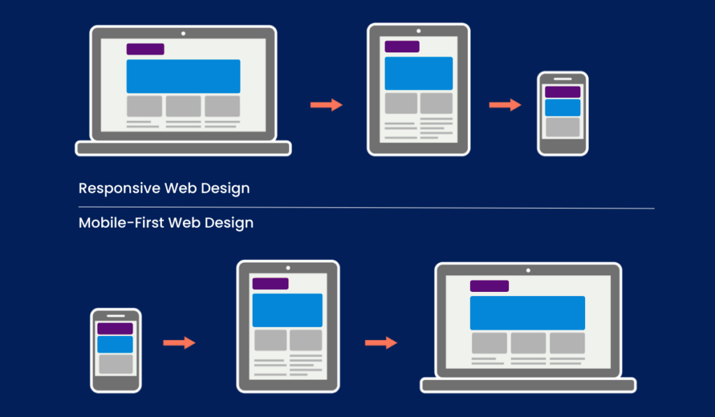
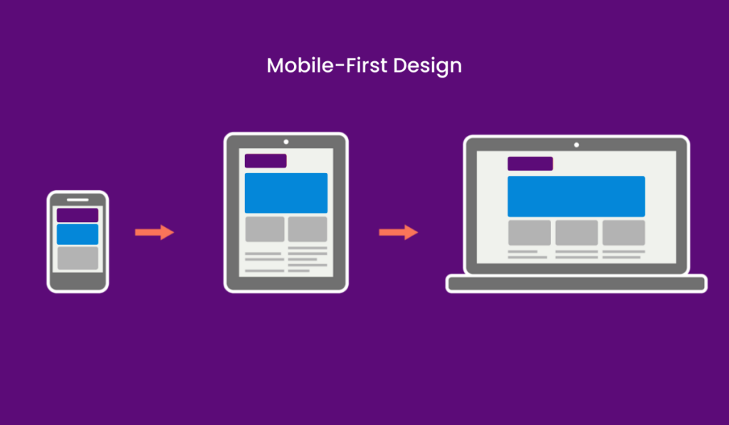
Mobile-first responsive design centers on mobile users’ needs throughout the development process. As such, the entire design and testing process focuses on recurrent tests to ensure that the outcome suits different types of mobile phones in the modern market.
While this doesn’t mean overlooking the importance of user experience for devices such as desktops, laptops, and other similar products, it does prioritize the best possible experience for mobile device users.
A few years ago, opening a website’s app often led to finding an unusable mobile version. At this point, developers were using a responsive design to create a desktop environment and then to adapt the products for mobile use. The focus on desktops slowly relegated mobile design for applications and software to mere second-tier versions.
For many old-school designers, accepting the changing scope of software design and development has taken a considerable amount of time. However, the trends speak volumes about the shifts in the market. We can no longer overlook the advantages of mobile-first design principles.
Let’s consider, again, statistics related to mobile phone use. In 2022, more than 3 billion individuals owned smartphones. It’s also estimated that the average user checks their smartphones about 58 times a day (are you guilty of this, yourself?).
We know that mobile users browse the internet for news, entertainment, information, and to send and receive messages from almost anywhere. Whether waiting for a doctor’s appointment, commuting by train, or enjoying a leisurely jog, it seems as if our mobile phones are permanently by our side.
There’s no doubt about it: Designers and developers keen on building high-demand apps and software need to embrace a mobile-first web design strategy.
A testing and design strategy that primarily considers a product’s use on any mobile device platform is considered a mobile-first design strategy. Not to say that desktop experiences are disregarded; rather, it places a greater importance on the mobile experience.
Of course, that wasn’t always the case. Long before mobile phones and other portable devices became so popular in our daily lives, the desktop experience was paramount. But, as the saying goes, “for everything there is a season.” We live in a mobile-centric world, and any app or product being developed should incorporate a proper mobile testing strategy.
Now that we understand the strategy, let’s delve into the four pillars of mobile-first design and how they relate to a valuable mobile user experience.
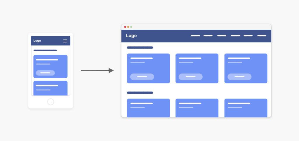
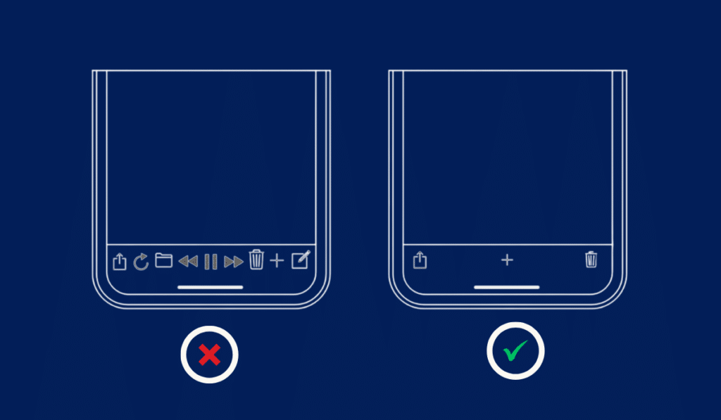
Not all content is equal, and experienced designers understand that layout and prioritizing some content over others is an important part of the process. So, what should take precedence for mobile app use?
Efficiency, ease of use, and simple navigation are key. Pitfalls of mobile navigation include smaller screen size, and limited tools to interact (hello, thumb!). Collapsible menus, “hamburger” menus, and bottom navigation are already universally familiar to mobile users, so make the most of them!
Source: Ahmad Shadeed
Mobile users are on the go, and they can’t always sit back and relax while information loads onto their phone. Quick load times are significant for the mobile user experience – even more so than they are for desktop users – and it’s important to become well-versed in factors that affect load time, such as image sizes and server response.
Back in the days of landline telephones, one phone directory company offered the tagline, “Let your fingers do the walking.” Landlines are a thing of the past, but our fingers (well… perhaps our thumbs) are factoring into how we interact with mobile apps.
Of course, desktop users can use a simple mouse and keyboard setup to surf the web. Mobile users? Not so much. That’s why the best mobile applications will plan to include larger, easily “tappable” buttons and links.
First, let’s assess your current website’s mobile compatibility. How? Great question! Kobiton offers an array of tools, in addition to the guidance of experienced industry professionals. We’re able to perform a mobile-first design audit in no time, leading to insights for mobile-first strategies.
Customer data rules everything, and the success of any business depends on understanding as much as possible about existing and potential customers. That goes for mobile use, too! Learn about their habits online — what devices are they using? Where are they at when using them? How much time do they spend online? Kobiton is able to provide analytics tools that get to the root of your customers’ behavior, and we’re also able to help you gain insight from data gathered by those analytics tools. With that information, we’re able to help you create and implement successful mobile-first strategies.
Kobiton offers a wealth of resources that help identify priorities for mobile platforms. Image size impacts the mobile experience, regardless of platform; it’s also a good idea to prioritize which images are crucial to a successful product. Identify key CTAs, and strive for a minimalistic design. Bells and whistles are great, but if they distract users from what you want them to do, then you’re not thinking with an optimized mobile-first mindset.
The importance of loading speed for mobile users simply cannot be stressed enough. Investigate ways to improve loading time, and what other factors might influence that — will users have strong connections while using your app, or should you consider ways to have data loaded on devices before its in use? Contact us today to learn about tools and best practices for mobile speed optimization.
Responsive design is an important component of app development because it allows users to realize a much more effective experience, no matter which device or platform they’re on. Kobiton engineers are well-versed in traditional and cutting-edge steps to implement responsive design elements, and we can recommend the most effective tools to help you achieve truly responsive web design principles.
A core problem with the desktop-first model was the existing limitations across different platforms. The mobile-first strategy’s vital benefit is its responsiveness to different platforms. The high level of compatibility with varying platforms affirms its superiority. In most cases, the same design on mobile phones will also be what the users see on the desktop.
The shift toward a responsive model in the design and testing of software further confirms the impact of mobile-first in shaping trends in the industry. Most web designs now automatically adjust to different platforms and screen sizes.
Content is at the core of the modern internet space. However, users want content that solves their concerns without necessarily struggling to make buyer-related decisions. With the mobile-first strategy, there’s simply no room for useless content. The mobile-first design provides information that helps the buyer throughout the purchase process.
This means that the information a mobile phone user needs is easy to access, understand and utilize. With mobile-first design principles, the screen is set in a way that makes the text easy to read, with short paragraphs and descriptive content.
Most of the current rankings on SERPs are influenced by the quality of the underlying search engine optimization strategies. Today, adaptive mobile design is critical in shaping your website’s SEO rating. It’s worth noting that search engines such as Google currently use mobile-first indexing as the primary grading premise.
As such, designers who aren’t optimizing for SEO will have a huge problem trying to remain relevant with content. This may result in the loss of potential customers and lead to overall sales declines.
When designing a website, application, or software, the main focus should be ensuring a top-notch user experience. With the mobile-first strategy, designing a product that best suits the modern user is easy.
A website that’s too hard to use or navigate will probably experience high levels of abandonment. A mobile-first approach ensures that these issues are resolved on the go.
We’ve all been there — using a mobile app that crashes, or fails to deliver in some way. How many times did you revisit the app, before abandoning it for a different one? We never get a second chance to make a first impression, and a top-notch user experience is crucial.
Most mobile websites are simple. This is because these websites use simple code, and, in some cases, they don’t have codes. The fact that the sites can be progressively enhanced means that the end product will be less buggy. In the past, the desktop-first mobile application was marred with bugs due to its inherent designs. However, modern users enjoy a great deal of simplicity and security with the mobile-first approach.
To put it simply, mobile-first design = less bugs. And that’s something everyone can get behind!
One of the main setbacks of this design is the restrictive nature salient in the setup. Users may often experience limitations associated with space and creativity. As such, users must be constantly selective with the content they include. This can be a significant turnoff for web designers who want to utilize many design elements.
Further, while the design may have easy-to-navigate prompts for experienced users, it may pose a challenge for first-time users needing more time to get accustomed to the design.
As for cons? Well, it’s possible to overlook the importance of also considering desktop design. We recommend a sound mobile-first design strategy, but one which also budgets for an investment in design that benefits all other likely scenarios.
A mobile-first strategy can only grow more popular in the future; a mobile-first design is important because everything can depend on it! As more users embrace smartphones and the benefits of these devices, it’s time to embrace the mobile-first strategy. With this concept, users enjoy more straightforward navigation, fewer bugs, and convenience.
Kobiton prides itself on being amongst the top-rated mobile-first testing platforms today. Our ability to deliver faster release cycles sets us apart from our competitors. You can call our team of experienced staff today for more information and questions, purchases, or orders.
Ready for a demo? Kobiton professionals are standing by, ready to discuss all the ways that the advantages of mobile-first design strategy can complement your own company’s agenda. Click here to get started.