
What mobile UI testing actually proves
A mobile UI testing run that comes back green on an emulator or a single flagship is measuring one controlled condition, not the range of conditions your customers actually use. Mobile UI testing, also called mobile user interface testing or mobile GUI testing, verifies that an application’s interface renders and behaves correctly for the people using it: that controls sit where they should, text stays readable, and every button is reachable and operable. The detail that
gets missed is that UI correctness is device-conditional. The same build that looks right on your emulator can clip under a notch, overflow at a large font size, or hide its submit button behind a mid-range phone’s onscreen keyboard for a real customer. A passing UI test on one device proves the screen is correct on that device, and nothing more.
That gap is where the trouble lives. “The UI test passed” quietly gets read as “the screen is correct for everyone,” and those are not the same statement. The first is true. The second is a guess about every device condition you did not run.
This guide treats the device condition as the method, not a caveat. You will get a device matrix that turns fragmentation into a test plan, two assets that make device-conditional breaks visible and force a ship-or-hold call, a worked failure that ships through a green pipeline, and the reason these particular bugs survive the tests you already run.
UI correctness is device-conditional
One device cannot speak for the rest because the interface is not a fixed artifact. It is rendered, at runtime, against whatever hardware, OS, and user settings the device brings. Change the conditions and you change the screen.
The conditions that change the UI
A short list of variables produces most device-conditional UI breaks:
- Safe areas, notches, and camera cutouts that push content into regions the layout did not reserve.
- Aspect ratio, from 16:9 through 19.5:9 and 20:9 to foldables that change shape mid-session, moving primary actions above or below the fold.
- Pixel density bucket, from mdpi to xxxhdpi, which scales assets and tap targets unevenly.
- Dynamic Type on iOS and font scale on Android, where a user who sizes text up can overflow a label or clip a disclosure.
- Right-to-left locales, which mirror the layout and can leave the primary action in the wrong tap path.
- Dark mode, where a color pair that cleared contrast in light mode drops below the threshold.
- Keyboard and input-method state, where the onscreen keyboard covers the field or the submit control.
- OEM skins such as One UI, MIUI, and OxygenOS, which alter rendering, animation timing, and system-dialog behavior.
- Locale text expansion, where German, French, or Finnish strings wrap or truncate a button sized for English.
None of these is a soft “layout issue.” Each has a measurable bar. Tap targets have measurable thresholds: 44 by 44 points on iOS, 48 density-independent pixels on Material, and a 24 by 24 CSS-pixel floor under WCAG 2.2 Success Criterion 2.5.8 at Level AA. Text and interface contrast have ratios: 4.5:1 for normal text, 3:1 for large text and interface components. A break is a specific failure against a specific threshold on a specific device condition, which is exactly what makes it testable.
The Device-Conditional Failure Matrix
This is where mobile UI testing becomes systematic: once you accept that the condition produces the break, the test plan writes itself as a matrix. Each row maps a device or OS variable to the UI break it produces and the artifact that proves it:
| Device / OS condition | UI break it produces | Proof artifact |
| Safe area / notch / cutout | Header or action clipped, content under the cutout | Real-device capture at the step |
| Aspect ratio (tall, foldable) | CTA pushed below the fold, element off-screen | Per-device capture vs baseline state |
| Density bucket (mdpi to xxxhdpi) | Label and input overlap, mis scaled tap target | Per-device capture |
| Dynamic Type / font scale up | Text overflow, clipped disclosure, broken layout | Capture plus accessibility validation |
| RTL locale | Mirrored layout, primary action in wrong tap path | Per-device capture |
| Dark mode | Contrast drops below threshold on disclosure or error text | Contrast validation |
| Keyboard / IME raised | Submit control or field occluded | Capture at the keyboard-raised step |
| OEM skin (One UI, MIUI, OxygenOS) | Altered rendering, animation, system-dialog behavior | Real-device capture |
| Locale text expansion (DE, FR, FI) | Button text wraps or truncates, layout breaks | Per-device capture |
Read the matrix as a checklist, not a wish list: a UI checklist for mobile application testing that scores every critical screen against the conditions that can actually break it, where every row resolves to an artifact you can put in front of someone.
Why one device cannot stand in for the rest
The instinct to validate on one clean device is the instinct the field punishes. An emulator renders a desktop-silicon approximation, not the constrained chip, skin, and input stack a customer carries. A single flagship is the configuration least likely to break, so signing off on it measures your best case. And the
common shortcut of comparing each build to one approved screenshot validates a single baseline image, not correctness across the matrix. One device is one data point about a surface that changes per device.
Why these UI bugs survive your pipeline
Device-conditional UI breaks are not slipping past weak testing. They slip past good testing, because they are invisible to the signals your pipeline watches.
They pass functionally. The locator found the button. The assertion checked that the element was visible, and it was visible in the view hierarchy, just rendered off-screen, clipped, or behind the keyboard. Functional truth and visual truth diverge, and the functional layer is the one your automation usually asserts on. The flow is green and the screen is broken at the same time.
They throw no error. There is no exception, no stack trace, no failed assertion for a CI job to catch. A button the keyboard covers is a perfectly healthy button that the user cannot reach. Nothing in the run is technically wrong.
They never hit a crash log. The app did not crash. It rendered exactly what it was told to render, on a screen shape it was not designed for. Crash-free session rate, the metric many teams treat as the health bar, stays pristine.
They get miscategorized downstream. The customer who cannot complete the form abandons it. In product analytics that reads as a drop-off, which reads as weak intent or a confusing flow, which routes to a growth or design conversation. The device-conditional defect is now wearing the costume of a demand problem, and the team optimizes the funnel instead of fixing the screen.
This is why the recurring sentence from teams with mature automation is some version of: our tests are green and we are still losing high-value flows on devices we do not test. The pipeline is doing its job. It is just not watching the layer where the break happens. The bug you do not catch on the matrix you catch the
expensive way, by hand, on a real device, late, after a customer or a support ticket finds it for you.
Run one step across the matrix: the Functional-Pass / UI-Fail table
Mobile app UI testing, in motion, is simpler than it sounds. Take one critical step, login, one-time-passcode entry, an application form, a disclosure acceptance, a submit or pay action, and run that single step across the prioritized matrix, comparing each device against the same baseline state. The question shifts from “did the flow pass?” to “which device condition made the UI fail?”
The output is a table that makes the divergence between functional and visual truth explicit, with a release decision attached to every row:
| Step | Functional result | UI / visual result | Device condition | Release decision |
| Submit application | Pass (button in hierarchy) | Fail (button behind keyboard) | Mid-tier, tall aspect, IME raised | Hold |
| Accept disclosure | Pass (checkbox toggles) | Fail (disclosure text clipped) | Large font scale | Hold |
| Enter OTP | Pass | Pass | Flagship, default settings | Ship |
| Review summary | Pass | Fail (CTA below fold) | Compact device, dense locale | Hold |
A row that passes functionally and fails visually is not an edge case in your report. It is the report. It tells the release owner precisely which device segment is broken and why, which is the difference between “looks fine to me” and a defensible ship-or-hold call. Treat that row as a release hold, not a known issue you ship around.
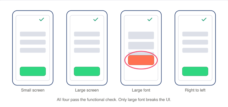
To make the divergence legible to people who are not in the tooling, the supporting visual is a single step rendered across several device conditions, side by side, with the break circled on the device that fails. That figure is an illustration of the method, not a screenshot of any one product.
What a real-device platform gives you underneath it is the capture itself: running the step on actual devices through real-device testing, and reviewing each run in a per-device session timeline where the break shows up at the exact step it happens, with accessibility checks flagged inline and visual validation available on the capture.
How to build your device matrix from traffic
A matrix is only useful if it reflects the devices your customers actually carry, which means you build it from your own data, not from a list of popular phones.
Start with your analytics. The top device, OS, and locale combinations that cover the bulk of your sessions become the primary matrix, the set you run on every build. The long tail rotates on a schedule, weekly or per release, so coverage stays honest without testing every model every time. This is the same
prioritization a mature team applies to any expensive resource: spend the per run budget where the users are.
Then tie each critical screen to the conditions most likely to break it, so the matrix is specific rather than generic. A form screen pulls keyboard and input method state, font scale, and locale expansion. A disclosure or legal screen pulls contrast and Dynamic Type. A checkout or submit screen pulls safe-area insets and aspect ratio. The cross of “screens that matter” and “conditions that break them” is your actual test plan.
Expect the matrix to skew toward Android, and let it. Manufacturer variability is wider there, so coverage that splits evenly by reflex can underweight the platform with the broader device and OEM spread. Weight the matrix to the variability, not to a tidy fifty-fifty.
One boundary keeps this method from being confused with something it is not. This is correctness across devices within a single build. That is a different axis from visual-regression testing, which catches unintended UI changes across releases over time. Both are useful, and they answer different questions. Regression testing asks “did this build change the screen from last build?” The device matrix asks “is this build correct across the devices my users carry, right now?” Naming the distinction keeps you from filing device-conditional correctness under a category that already feels solved, because the across releases tools do not answer the across-devices question.
A worked example: when the flagship hid the broken submit
From an anonymized engagement: a team finishes an application flow for a consumer finance app. The UI tests run on a flagship over office wifi. The submit button is present, the assertions are green, the flow completes. The build ships.
Run that same flow across the matrix and two rows from the Functional-Pass / UI-Fail table come to life: on a mid-tier device with the keyboard raised, the submit control sits behind the keyboard; on a device set to a large font scale, the disclosure text clips. The functional assertions stay green on both, because in the view hierarchy every element exists. The customer simply cannot finish the application.
Put the two states next to each other, the flagship-clean render and the mid-tier broken render. Two rows, both functionally passing, both visually failing, both a hold. The condition that produced the failure was not exotic. It was a common phone, a raised keyboard, and a font-size setting a real person turned on. That is not an edge case. It is a segment of customers on a build the pipeline already approved.
What it costs when the UI is correct for you but not the customer
A device-conditional UI break is expensive in three directions, and the first one is the one nobody sees.
Conversion, the invisible abandonment. A clipped CTA or a submit button hidden behind the keyboard on a device segment is an abandoned high-value flow that throws no error and reads as weak demand. The research on how users respond to broken interfaces is blunt, even if it measures the broad category rather than device-conditional failure specifically. A QualiTest survey of more than 1,000 US users found 88 percent would abandon an app over bugs and glitches, with about a third walking at the first one. That survey dates to 2017 and is still widely cited. RetailDive has reported mobile cart abandonment running higher than desktop, pushing the global rate near 73 percent. An AppDynamics study with Goldsmiths, University of London put the share who stopped using an app over poor performance near 90 percent. None of these studies isolated device-conditional UI breaks, but device-conditional breaks are
exactly the kind of glitch and broken-screen experience they describe, on the device the customer happens to hold.
Release velocity, the late and manual catch. Caught on the matrix, the break is a row in a table before release. Caught after, it is a hand-run reproduction on a borrowed device, a hotfix, and a cycle you did not plan to spend. The broader tax is real: industry reports indicate engineers commonly lose significant time each week to flaky tests and test-environment maintenance. That drain is not unique to test code: Stripe’s Developer Coefficient report put the average developer’s maintenance and technical-debt load at more than 17 hours a week. Device-conditional bugs are a contributor to that drag, not the whole of it, but the pattern is the same. Work that should be systematic and early becomes manual and late.
Compliance, the regulated-app escalation. For banking, e-commerce, and transport apps, the same contrast, labeling, and touch-target break is also an accessibility failure. The European Accessibility Act has applied since 28 June
2025 under Directive (EU) 2019/882, covering consumer-facing mobile apps in those sectors, with EN 301 549 and WCAG 2.1 AA as the reference standard, and enforcement and penalties set at member-state level. US ADA Title III litigation over mobile apps adds a parallel exposure. The point for testing is that contrast, content labeling, and touch-target size are common WCAG failures and they are device-conditional, which is why surfacing them per device matters. A platform that runs mobile accessibility testing flags exactly these checks inline in the session timeline, so a compliance break shows up at the step and device where it happens rather than in an audit months later.
Building mobile UI testing into your release pipeline
The method earns its keep when the matrix becomes a gate rather than a pre launch scramble. Per-condition checks run per build, results are summarized
into the Functional-Pass / UI-Fail table, and a row marked hold actually holds the release.
In maturity terms, this is a move along a known path:
Level 01, Manual: manual single-device UI checks.
Level 02, Automated: automated UI runs.
Level 03, Automated at Scale: those runs across the device matrix. Level 04, DevOps: the matrix gated inside the delivery pipeline.
Device-conditional UI testing is mostly the 02 to 03 step: you already automate the flow, and the work is automating it across the devices that break it.
Authoring across a matrix is where maintenance usually scares teams off, and it is where the tooling has moved. The category of mobile UI testing tools is shifting toward AI-assisted and scriptless authoring, which lets you generate the cross-device runs and regenerate them when the app changes, through scriptless test automation or AI-generated Appium scripts, without hand maintaining a script per device. What those tools speed up is authoring the cross-device runs; the per-device visual and accessibility validation is still what surfaces the break. The method does not depend on any one tool, but the maintenance objection is weaker than it was a year ago.
The teams that win treat device-conditional correctness as a gate. Once it is, “the UI test is green” can no longer be mistaken for “the screen is correct for everyone,” because the gate has already asked the harder question for every device that matters.
If you want a read on where your mobile app testing sits today and what the next step looks like, the Mobile Maturity Assessment is a short, structured way to find out.
Mobile UI testing FAQ
What is mobile UI testing?
Mobile UI testing verifies that an application’s interface renders and operates correctly for the user: controls reachable, text readable, layout intact. Because the interface is rendered against each device’s hardware, OS, and user settings, correctness is device-conditional, so the real question is not whether the UI passed but on which devices it passed.
Should you test mobile UI on real devices or emulators?
Real devices for the truth that matters. Emulators run on desktop silicon and cannot reproduce the OEM skin, keyboard behavior, density, and rendering quirks that produce device-conditional breaks. Emulators are fine for early development loops; sign off belongs on real devices that match your traffic.
Why does the same app look different on different phones?
Because the screen is rendered at runtime against variables that differ per device: safe areas and notches, aspect ratio, pixel density, font scale, locale direction, dark mode, keyboard state, and manufacturer skins. Each can move, clip, or occlude interface elements without anything technically failing.
What is the difference between mobile UI testing and visual regression testing?
Visual regression testing catches unintended UI changes across releases over time, comparing a build to a previous baseline. Device-conditional UI testing checks correctness across the devices your users carry within a single build. Different axes, different questions, both useful.
How many devices do you need to test the UI on?
There is no magic number. Build the matrix from your own analytics: the top device, OS, and locale combinations covering the bulk of your sessions run on every build, with a long
tail on rotation. Weight it toward the platform and conditions where your traffic actually lives.