What mobile usability testing actually proves (and what it does not)
Mobile usability testing tells you whether a real person can complete a task in your app, and a passing result only proves they could do it on the one device, one OS version, and one network the session ran on. That gap is where many usability programs break down. The score goes green, leadership hears “usability passed,” and the app still frustrates a segment of users the study never touched.
Usability testing in a mobile application is the practice of watching real users attempt real tasks, then measuring where they succeed, stall, or give up. Run well, it answers a specific question: did people understand the design well enough to get through the flow? That question matters. It is also narrower than the number implies. A moderated session on a flagship device over office wifi is a controlled read on comprehension, not a guarantee that the same task holds on a three-year-old Android over a congested cellular connection.
Mobile UX testing has to account for what desktop testing never did: the same build behaves differently across hardware tiers, OS versions, input methods, and network conditions. Treat the result as a single verdict and you average away the exact conditions where users fail. The rest of this piece is about closing that gap: how to test a task across the conditions your users actually have, how to turn the findings into something your team can act on, and how to keep the result from decaying the moment you ship.
Why a lab or panel pass is only a partial signal
Usability testing for mobile apps usually runs one of two ways: a moderated session where a researcher watches users work through tasks, or an unmoderated study where a recruited panel completes tasks on their own devices. Both measure comprehension well. Neither measures whether the task survives the device and network distribution your analytics already show.
That is the core challenge in usability testing of a mobile application, one the standard methods are not built to catch. A panel of a dozen users tells you if the design makes sense. It does not tell you that a meaningful share of your traffic runs an OS version where an in-app keyboard covers the submit control, or that a mid-tier device drops task completion under a weak signal. Those are not comprehension problems. Users understood the flow perfectly. The conditions beat them.
Kobiton is direct about its own boundary here. It is not a user-research platform. It does not run moderated sessions or recruit panels. What it does is let you run the task on the physical devices, OS versions, and network profiles your users hold, and measure what happens. The two approaches are complements. Comprehension research tells you whether the design is right. Condition testing tells you whether the design holds up where it ships.
The pattern shows up repeatedly in discovery. A QA lead at a large e-commerce marketplace described their reality plainly: with the resources they had, they could check one real iOS device and one real Android device per release, and because of that, critical issues were reaching production. The design had passed. The coverage had not. That is the difference between a usability study that reads well and one that predicts what users experience.
The method: run one task across many conditions
The most reliable of the mobile usability testing methods for catching device-conditional failures is not more users. It is the same task across more conditions. Hold the critical journey constant, then vary the environment around it and watch the outcome move.
Pick the one or two tasks that carry your business: checkout, funds transfer, account creation, booking. For each, define the conditions that matter for your user base rather than a generic device grid. That means device tier (flagship, mid-range, older budget hardware), OS version spread, network profile (strong wifi, throttled cellular, intermittent handoff), and input state (software keyboard up, orientation change, interruption mid-flow). Then run the identical task across those cells and record four signals: task-completion rate, time-on-task, mis-tap or error rate, and abandonment point.
Build the condition set from your own device and network analytics, not a stock list. The device tiers with meaningful share, the OS versions your users actually run, the network profiles your traffic hits: that is the grid that matters. A condition set pulled from real traffic is the difference between testing what you have and testing what your users have.
The output is not a single score. It is a distribution. A task that completes cleanly on a flagship can lose measurable completion on a budget device over a weak connection, and the spread between those cells is the finding. The wider the spread, the more misleading a single average was.
How to do usability testing for mobile application flows, step by step
- Choose the task that maps to revenue or retention, not a peripheral flow.
- Define the pass signal in advance: what “completed” means, and the threshold for time-on-task and errors.
- Derive the condition grid from real traffic, not a stock device list.
- Run the task on real devices across every cell, capturing video and interaction traces.
- Record condition-specific failures with the exact device, OS, network, and input state attached.
- Promote any failure that reproduces into your permanent coverage, so it gets checked every release.
Steps one through three are where many teams under-invest. Depth on the journeys that carry the business beats breadth on flows that do not.
Build a device-and-condition UX failure matrix
Usability testing on mobile devices produces its most useful artifact when you stop reporting a score and start reporting a matrix. One task runs down the side. The condition vectors run across the top. Each cell holds the measured outcome, and the failing cells are ringed.
| Checkout task | Flagship, wifi | Mid-range, throttled 4G | Budget device, weak signal | Any tier, interrupted mid-flow |
|---|---|---|---|---|
| Task-completion rate | Pass | Watch | Fail | Fail |
| Median time-on-task | Baseline | Elevated | High | N/A (abandoned) |
| Abandonment point | None | Payment step | Address step | Field re-entry on resume |
→ swipe to see all conditions
Checkout: one task, four conditions
Same task. The ringed conditions are where users fail.
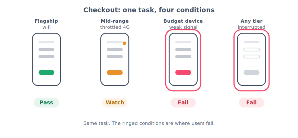
The matrix does three things a score cannot. It makes the failing conditions specific enough to reproduce and fix. It shows leadership exactly which slice of the user base is affected rather than a vague “some users.” And it turns usability from a subjective green light into a coverage map you can defend in a release review.
This is validation that requires real hardware. Emulators and simulators approximate the screen but not the physical behavior: the way a real budget device throttles under load, the way a physical keyboard occludes a control, the way a network handoff interrupts a request mid-task. A recruited panel does not reliably cover the matrix either, because you are sampling people, not conditions. The matrix is only as honest as the devices behind it.
Using the matrix as a mobile app usability testing checklist
Once the matrix exists, it doubles as a mobile app usability testing checklist. Before a build ships, the critical task has to clear its cells, and any regressed cell is a blocker until it is understood. Keep this distinct from a UI or layout checklist. A UI check asks whether elements render correctly. This checklist asks whether the user can finish the task under the condition. Rendering can be pixel-perfect while the task still fails because of a keyboard occlusion or a network timeout. The matrix tracks the outcome, not the layout.
Worked example: the task that passed, then failed on a real device
Here is a concrete mobile app usability testing example, drawn from a pattern that recurs in real device labs.
A team builds a multi-step form: a checkout, or an account setup. It goes through a moderated usability study on a current flagship, and it passes. Users understood every step. Completion was clean. The design ships.
In production, a segment of users on mid-range Android devices abandons the form at a rate the study never predicted. The cause is not a layout bug and not a crash. On those devices, a common interruption, an incoming call, a low-battery system dialog, or a switch from wifi to cellular, commonly triggers the OS to reclaim memory from the backgrounded app. When the user returns, the form has silently cleared the fields they already filled. Nobody re-enters twenty fields on a phone. They leave.
Standard comprehension testing does not surface this, because the failure has nothing to do with whether users understood the form. It is a device-and-condition failure: specific hardware, specific memory pressure, specific interruption. A real device, put under the actual interruption, is the reliable way to reproduce it. Once reproduced, the fix is straightforward: persist in-progress state and restore it on resume. The validation is to run the interrupted task back across the matrix until the affected cells recover.
The lesson is not the specific defect. It is that the study passed and the task still failed, and the only thing that caught it was running the real task on real devices under real conditions. Rather than lean on borrowed statistics here, measure your own: run your critical task through an interruption on your three most common devices and watch what happens to the fields.
What device-conditional failures cost the business
Mobile user experience testing earns executive attention when you connect condition-specific failures to money, and the mechanism differs by business model.
In a transactional app, a device-conditional failure is direct revenue leak. The user hits the broken condition, abandons the task, and does not come back to finish. The loss is quiet because aggregate reporting shows the flow "working," while a specific device-and-network segment silently converts at a fraction of the rest.
In a relationship business, the cost shifts from abandonment to support load. A wealth-management firm we worked with saw this directly: when a task failed on the app, customers did not leave the firm, they called in. As one leader put it, people are not going to abandon you, they are going to want support. The cost moved from lost revenue to higher support volume, and it traced back to device-specific issues surfacing in app-store reviews, a specific device class flagged, the device mix re-optimized in response.
Neither cost shows up in a usability score. Both show up in the matrix. When a specific device-and-network cell fails, you can put a number against it: the share of sessions in that cell, the revenue or support tickets attached to it, the gap between that cell and a passing one. That is the translation from a QA finding into a business case, and why the matrix travels further inside an organization than a pass or fail ever does. A score ends the conversation. A matrix with a ringed cell and a traffic percentage starts one with the person who owns the number.
Why the importance of usability testing for mobile apps has grown
The importance of usability testing for mobile apps has changed as mobile traffic has surpassed web for a growing share of businesses. When the app is the primary channel, a device-conditional task failure is not a QA footnote. It is a segment of your highest-intent users failing to complete the action that drives the business. That framing is what moves the conversation from a QA backlog to a VP of Engineering, a CPO who owns task-success and retention, or a CMO who owns conversion. The matrix gives each of them a number tied to their own metric.
From a one-off study to a usability gate in CI
The strongest mobile usability testing best practices treat usability as a continuous property, not a pre-launch phase. A study is a snapshot. The fleet moves: an OS point release changes keyboard or gesture behavior, a new device shifts the layout, a backend change pushes a task past its abandonment threshold. The study that passed is already stale the next time the environment shifts.
This maps onto a testing maturity climb with three clear stages:
- Manual, one-off. A usability study runs once, near launch, on a handful of devices. Fine for a first read, blind to everything that changes after.
- Repeatable at scale. The condition matrix becomes a standing suite, run across the real device set on demand, so the same task is checked the same way every time.
- Wired into DevOps. The suite runs inside the release pipeline. The critical task executes across its device-and-condition cells automatically, and a completion drop caused by an OS or build change fails the pipeline the same way a functional regression would.
That CI gate is what a research panel and a generic methodology article cannot offer. It only works when the underlying validation runs on real devices at scale, wired into the build. Note the boundary: this is about task completion under condition, not raw performance benchmarking. Load, throughput, and frame-rate profiling are a separate discipline. Here, perceived slowness matters only insofar as it pushes a user to abandon a task. The signal is always the outcome, did the user finish, not the metric in isolation.
Get this in place and usability stops being something you certify once and hope holds. It becomes something the pipeline defends on every release.
Mobile usability testing FAQ
Common usability testing questions for mobile app teams tend to cluster around scope and fit.
What is usability testing in mobile application development?
It is the practice of having real users attempt real tasks in the app and measuring where they succeed or fail. The distinction that matters is condition: a result only holds for the device, OS, and network it was measured on, so coverage across conditions is part of the test, not an afterthought.
How is this different from UX research?
UX research measures whether users understand and value the design. Condition testing measures whether they can complete the task on the devices, OS versions, and networks they actually use. You want both. One tells you the design is right, the other tells you it holds up in production.
What are the main challenges in usability testing of mobile application releases?
The biggest is device and network fragmentation: a study on a narrow device set does not generalize. The second is decay, since the environment shifts after launch. Both are coverage problems, not design problems.
How many devices and conditions should I test?
Build the set from your own analytics, not a stock grid. Cover your top device tiers, the OS versions with meaningful share, and the network profiles your users hit, plus interruption and input states for the critical task.
What should I measure?
Task-completion rate, time-on-task, mis-tap or error rate, and abandonment point, recorded per condition so the failures are specific enough to reproduce.
Where does it fit in CI/CD?
As a task-completion gate on the critical journey, run across the device-and-condition matrix on each build, so a regression is caught before release rather than in an app-store review.
A failing condition on a critical journey is a release hold, not a known issue you ship around. If the task cannot be completed on a device and network a real segment of your users has, the app is not ready for that segment. Run your critical task across the conditions your users actually hold, and see what the study missed.
For a read on where your usability program sits today and where it could go next, the Mobile Maturity Assessment is a short, structured way to find out.
